
Explore interior trends, AI design insights, styling guides and real transformations
Art on the Wall: 8 tips and 32 layouts for European homes
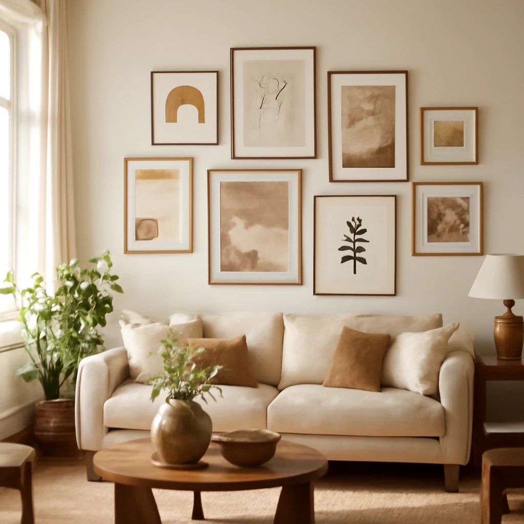
Introduction
Turning a blank wall into a curated gallery is a timeless ambition for European homes, from compact city flats to airy living spaces. The challenge, more often than not, lies in achieving a display that feels intentional rather than cluttered. Whether you favour posters, oil paintings, watercolours, or cherished family photographs, the same rules apply: balance, proportion and rhythm. The eight practical guidelines that follow, complemented by thirty-two ready-to-use layouts, will help you craft a gallery wall that reads as a deliberate design statement rather than a random collage.
In European interiors, walls range from plaster with warm patina to smooth plasterboard, brick, or stone. The best layouts respect the architectural rhythm and the furniture below. They consider light, scale and the breadth of a room, so a gallery wall can anchor a seating area, mark a corridor, or transform a staircase into a moving artwork. This article breaks down the process into clear steps and offers variations that suit different spaces, from salons and dining rooms to corridors and even compact bedrooms.
1. Determine the right placement
Before hanging anything, decide where the composition will live and how tall it will be. Avoid placing works too high, you want a natural line of sight to rest on the art rather than craning the neck. Stand opposite the intended wall and imagine the viewing zone. Mark the line at which your gaze naturally settles - without tilting the head up or down.
From the bottom edge of the artwork, mentally offset by 2–3 cm. This ensures the image sits at a comfortable, balanced level. If ceilings are notably low (below about 2.4 m), offset the bottom edge by about 6–7 cm to maintain proportion with the space. When planning the placement, consider the furniture beneath. A piece or a cluster should ideally span between 75–90% of the width of the furniture it sits above, whether a sofa, a console table, or a bed side row. This creates a sense of visual connection between wall and furniture.
Practical steps for execution:
- Mark the wall with painter’s tape at the intended baseline and use a laser level to verify horizontal alignment.
- Measure the width of the furniture and calculate 75–90% as your target range for the overall width of the artwork group.
- For multiple pieces, rough lay them out on the floor first to test the rhythm before holes are drilled.
2. Make a case for symmetry
Symmetry remains one of the simplest, most reliable methods for a polished display. If you are unsure, start with a central axis: imagine a vertical line at the room’s midpoint and place one or two frames along that line. Then hang the remaining pieces at equal distances on either side. Even with a varied mix of sizes, a symmetrical arrangement feels balanced and calming, especially in living rooms and dining areas where furniture creates a natural anchor.
Tips for achieving even symmetry:
- Maintain uniform frame depth and similar profiles for the surrounding pieces to create a cohesive field.
- Use identical hanging hardware and wire length for frames in the same row to keep alignment precise.
- Check from eye level and adjust as needed, small shifts can dramatically improve the read of the group.
3. Arrange artworks of the same size
If you are lucky enough to own several pieces of identical format, arranging them is straightforward and can read as refined restraint. A row of equally sized frames with equal spacing creates a crisp, modern line. However, the most interesting displays often mix elevations - varying the vertical position of pieces even when their dimensions match can produce a lively, gallery-like vibe. When you do prefer a strict grid, use a consistent gap, commonly around 6–8 cm, to keep the sequence legible and calm.
Practical approaches:
- Line identical sizes along a single horizontal axis, with consistent gaps to emphasise repetition.
- For a more dynamic effect, stagger frames at different heights while preserving a shared horizontal or vertical rhythm.
- Consider matting with a neutral mount to unify frames that vary in content but share format.
4. Establish a central anchor
To achieve cohesion, designate the largest artwork as the central anchor, then arrange smaller pieces around it. This creates a natural focal point and a clear reading order. Position the central piece either directly in the centre of the overall composition or slightly off-centre to add a touch of dynamism - just ensure the surrounding works balance the weight. When constructing the ensemble, opt for frames with the same thickness or similar design language to maintain harmony while allowing individual images to breathe.
Strategic considerations:
- Place the tallest or widest piece at the base of the central axis to ground the arrangement.
- Align the bottom edges of the surrounding frames to a shared baseline or use a small but deliberate vertical offset to create a subtle wave of height.
- Test the layout by taping cutouts of each frame size onto the wall, this helps visualise scale and spacing without committing to holes.
5. Include a round element
Round mirrors, circular frames, or curved art can introduce softness and contrast into a predominantly rectilinear gallery wall. Place the circular element at the centre of the composition and surround it with smaller pieces. Be mindful not to place a circle at the same size or larger than the central element, as the visual hierarchy must feel intentional rather than repetitive.
How to balance round elements:
- Choose a central circular piece with a frame that has the same visual weight as the surrounding rectangles or slightly lighter to avoid competing focal points.
- Use a mix of soft textures or subtle glazing to temper the shine of mirrors and glass in bright rooms.
- Consider the light source, a round mirror can reflect daylight and brighten a living area, enhancing the gallery’s ambience.
6. Think outside the grid
If rigid grids feel stiff, adopt a more generous, less formal approach. Experiment with sizes and shapes to create a composition that feels intentional yet free. Think of arranging pieces in the shapes of a triangle, a cloud, or a loose diagonal line. Variety in scale and orientation adds texture and energy, which can be ideal for contemporary interiors or rooms designed for sociable living.
Guiding ideas:
- Mix photographs, prints, canvases and small three-dimensional objects to craft tactile interest.
- Leave intentional gaps to let individual works breathe, a slightly irregular arrangement reads as curated rather than haphazard.
- Use a colour or finish thread - e.g., warm wood frames with cool-toned art - to tie disparate pieces together visually.
7. Let a shelf bear the art load
For those who wish to avoid multiple wall holes or to reconfigure layouts frequently, a long, slender shelf offers a versatile alternative. Start with the largest works to establish the framework, then lean smaller frames in front or rest them on the shelf. Ensure artworks of different sizes are present and arranged so they do not obscure one another. This approach works well in living rooms, hallways and bedrooms with limited wall depth.
Practical shelf strategies:
- Place the largest pieces first, creating a solid anchor, then layer smaller items forward or slightly in front of them.
- Combine framed art with decorative objects such as vases, books or sculptures to create a cohesive vignette rather than a collage of separate pieces.
- Periodically reassess the shelf display, movement keeps the space feeling fresh and curated.
8. Decorate a wall along a staircase
Staircase walls are perfect for storytelling as you ascend or descend a space. Hanging art along the stairwell can be done in several ways. A straightforward approach is to align a series of works parallel to the floor, keeping a consistent distance between frames. However, to avoid empty corners, start at the top and gradually lower each successive frame, creating a staggered rhythm that follows the architectural flow of the staircase. Maintain even spacing, but allow slight variations to mirror the landings and turns of the stairs themselves.
Practical tips for stair walls:
- Use a level and a soft tape measure to maintain uniform gaps (commonly around 6–12 cm between frames).
- Consider using a single shelf or ledge along the stair wall to support layered arrangements, especially when the wall depth is shallow.
- To prevent damage on high-traffic stairs, opt for lightweight frames and ensure mounting hardware is appropriate for the wall type (plaster, masonry, or timber studs).
Additional considerations for European homes
While the eight guidelines provide a robust framework, several practical details suit European interiors particularly well:
- Wall composition varies across Europe - from plaster and lime plaster to brickwork. Choose secure fixing methods appropriate to the substrate and, when in doubt, consult a professional. Where possible, use rail systems or French cleats to allow easy rearrangement without repeated drilling.
- Lighting plays a crucial role. Consider a close-to-ceiling track or concealed picture lighting that washes the wall without creating glare on glass or shiny frames. Dimmable options offer flexibility for daytime and evening aesthetics.
- Frame and mount choices influence the overall feel. Light oak, warm walnut, or black metal frames can define either a Scandinavian-influenced space or a bold modern gallery, depending on the wall colour and room temperature.
- Colour strategy matters. A neutral backing wall (soft grey, warm white, or pale taupe) helps diverse artworks read together. If you prefer coloured walls, keep the art within a restrained palette or choose frames that pick up subtle colour accents in the artworks.
Practical steps to start your gallery wall project
1) Gather a representative selection of artworks: a mix of sizes, media, and frames that you love. 2) Decide the focal point and create a mock layout on the floor using paper cutouts or cardboard templates. 3) Photograph the floor plan for accuracy and re-check measurements on the actual wall. 4) Mark the wall with painter’s tape according to the final layout, use a level to ensure straight lines. 5) Drill carefully and install frames with appropriate wall fixings. 6) Light the wall to enhance texture and colour. 7) Revisit the arrangement after a few weeks, swap or rotate pieces to keep the display fresh.
Conclusion
A well-crafted gallery wall is more than a collection of artwork, it is a narrative on a wall. By considering placement, symmetry, size relationships, focal anchors, and the rhythm of rhythm, you can create a presentation that feels effortless yet intentional. The eight strategies outlined here offer a practical toolkit for European homes, whether you are mounting a single statement piece above a sofa or composing a large, evolving montage along a corridor or staircase. Remember that art is personal but not arbitrary: let scale, proportion and balance guide your decisions, and your wall will become a living part of the room's design language.
You may also like these articles
 Renovation
Wall Levelling: A European Guide to Perfect Walls
Practical, step-by-step guidance on wall levelling for European homes.
Small Spaces
Compact Living Masterclass: Zoning, Storage and Style for 30 m² European Flats
Practical strategies to design and zone 30 m² flats across Europe with style.
Small Spaces
Smart design for compact European bathrooms: space-saving solutions
Smart strategies for tiny European bathrooms: maximise space with layout, light and durable finishes.