
Explore interior trends, AI design insights, styling guides and real transformations
Colourful Wardrobes: A Practical Guide to Painting for Space and Style
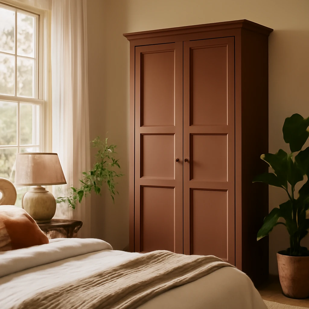
Why paint a wardrobe
In contemporary European interiors a brand new wardrobe often becomes a design element that benefits from colour. Designers repaint wardrobes not only for aesthetics but for practical reasons within compact living spaces that are common across European cities.
Goal 1: make the room feel larger. Freestanding wardrobes placed near the entry or along a long wall can look heavy and intimidating. Painting the wardrobe in the same colour as the walls helps it dissolve into the background, allowing the room to breathe. In small city flats where space is precious, this simple trick is widely used by professionals working on open plan living spaces and corridor zones across Europe.
Note: in dense urban layouts it is common to disguise a wardrobe by aligning it with the wall colour and texture.
Task 2: zone the room
Another practical use of colour is to zone an open plan layout. By painting part of the wardrobe in a contrasting colour, designers can visually separate areas such as the entrance from the living area or the work zone from the relaxing zone. The effect can be enhanced by painting the ceiling a shade that echoes the wardrobe colour, reinforcing the sense of division without adding physical barriers.
In a compact studio in a European city, a turquoise wardrobe and a matching ceiling can delineate the entry from the main living space while remaining cohesive with the overall palette.
Task 3: brighten the everyday
A bold wardrobe can inject energy into a subdued interior. In climates with long grey winters, rich saturated colours in the home are a mood booster. The key is to curate the palette so the wardrobe acts as a focal point supported by complementary colours in soft furnishings and textiles.
How to achieve the right shade
Finding the exact shade that integrates a new wardrobe with existing finishes is challenging. The main difficulty is that wardrobe materials differ from wall surfaces. A blue door set on a blue wall may read differently due to the substrate and the paint type used. Online images are often colour corrected, so rely on physical samples when possible.
The colour selection begins in the design brief. Decide the target shade first, then search for wall paints that harmonise with it. If the project involves a compact European flat, the emphasis is on ensuring the hue reads consistently across materials and lighting conditions.
The colour should be anchored in the design record. A common method is to select the wardrobe colour and wall colour from a single mixing system. If the front is to be blue and the walls are blue as well, the two should be mixed to the same shade to ensure uniformity across materials.
A simple way to hit the tone
- Choose the wardrobe colour and the wall colour. For a blue wardrobe on blue walls decide whether the shade will be light sky blue, vivid cobalt, or deep navy.
- Find a suitable tint in a palette used for façades. Typical universal palettes are the RAL and the NCS systems. They provide a wide range of code-based colours suitable for furniture, laminates, and wall paints alike.
- Order the façades and, if needed, the wardrobe frame in the chosen shade. Prepare the surface and paint the walls. Remember that textures differ between wall finishes and wardrobe facades, so the eye may perceive the same tint slightly differently, but the aim is that they appear as one continuous colour.
Palettes and colour matching are widely used in furniture finishing across Europe.
What are RAL and NCS
RAL is a widely used colour standard developed by a European standards body for paints and coatings. It defines a colour space and assigns a numerical code to each hue. NCS is a colour model developed by the Nordic Colour Institute. It describes colour as we perceive it, enabling precise identification of hues that the human eye recognises. Both palettes are suitable for selecting finishes for wood, laminates, and paints.
Colour samples for wood finishes are commonly presented in RAL and NCS ranges.
Choosing the paint
The wardrobe and the walls and ceiling are treated with different types of paint. Wall surfaces use interior wall paints, while wood based panels such as MDF require enamel or specialised coatings. Interior paint may not adhere well to bare wood or laminated surfaces. Designers typically repaint the furniture to the desired shade first, then tint the interior paint to match. This helps achieve a cohesive result.
Tip: to keep costs sensible without abandoning the bright look, consider purchasing a ready coloured piece of furniture from a retailer, and integrate it into the design.
Where to find bold wardrobes
Bold wardrobes have been a long lasting trend in Europe. They come in a range of finishes and can be integrated in various ways depending on the space and light.
Wardrobes with coloured fronts
It is common for the cabinet body and the doors to be made from different materials. The same white shade on MDF and on particleboard may appear different due to material undertones. When a wardrobe sits flush in a niche, the body colour is less important than the colour of the doors. Freestanding wardrobes can look striking when the doors are a vivid tone while the body remains neutral, or vice versa.
In some configurations, only the doors carry the bold hue while the carcass remains a natural wood or pale neutral. This is a reliable strategy for achieving impact without overwhelming the room.
A bold turquoise cabinet, for example, can be paired with neutral surrounds and echoed in textiles and accessories for cohesion.
Hidden paint within the wardrobe
Another variation is to paint only the interior or selected compartments of the wardrobe. This approach provides a surprise splash of colour that can be hidden when the doors are closed, yet visible when opened. If you prefer more contrast, paint the interior in a different shade from the external surfaces.
- In a compact city apartment, a wardrobe with bold interior colour can create moments of delight without dominating the room.
- In a larger home, interior colour can coordinate with cushions, rugs, and art to reinforce a cohesive scheme.
The interior colour should be carried through other soft furnishings to maintain unity in the space.
Wardrobes with prints and patterns
A wardrobe with a print or pattern makes a strong visual statement. To avoid overpowering the room, follow a few guidelines. Ensure the wardrobe is anchored to the room palette. If the print is large and vibrant, keep other patterns in the room minimal, such as neutral fabrics or restrained stripes. A smaller, repeated motif can be balanced with solid colours and quiet textures to maintain harmony.
A floral motif on the wardrobe can coordinate with cushions and art in complementary colours, creating a cohesive design language.
How to repaint an old wardrobe
When the aim is a refresh rather than a full replacement, repainting the wardrobe can be a cost-effective solution. In Europe, many interiors favour solid wood or high quality plywood wardrobes that respond well to repainting. Solid wood furniture is typically the easiest to repaint and can acquire a completely new life with the right finish.
For many projects with built in kitchens or wardrobes with laminate surfaces, repainting is more challenging. Laminate and melamine finishes do not hold new coats well without proper surface preparation and primers.
In a country house in the countryside, an inherited pine dresser was renewed with a deep charcoal grey after careful prep and enamel finish.
What materials and tools are needed
- Respirator to avoid inhaling dust and fumes
- Rubber gloves for hand protection
- A screwdriver set to dismantle the piece as needed
- Painter's tape to protect areas not being painted
- Sandpaper for surface preparation
- Cloths and brushes for cleaning and applying
- Putty for filling nicks and dents
- Degreaser and primer for surface preparation
- Flat brush and roller for applying primer and paint
- Container for paints and tools to keep the workspace tidy
Hardware such as hinges and handles may need to be replaced to match the new colour.
Note: Safety first. Always follow product instructions and work in a well ventilated space.
How to paint the furniture
Painting any surface follows a similar sequence, with the main differences arising from the substrate and the finish. If you intend to paint the wardrobe yourself, follow these steps:
- Disassemble the piece if possible. For doors or if the structure cannot be easily dismantled, mask with tape the areas you will not paint.
- Clean thoroughly to remove grease, dust and grime that would prevent adhesion
- Sand the surface to create a key for the primer. A power sander can speed up the job, but hand sanding works well too
- Dust-free finish by removing all dust with a cloth or vacuum
- Fill any defects with putty and smooth
- Degrease the surface again to ensure the primer adheres
- Apply primer in one or two coats, depending on the surface. The primer helps cover the existing colour and improves adhesion
- Apply paint in two or three coats. One coat will not achieve full coverage, allow each coat to dry completely
- Seal with varnish or wax to protect the finish from daily wear
Before embarking on a repaint, consider watching practical tutorials for additional tips and tricks. They can reveal efficient methods and helpful hacks to ease the process.
In conclusion
A boldly coloured wardrobe can invigorate a room and anchor a contemporary interior. To achieve a precise match and harmonious integration, keep these principles in mind:
- Plan at the design stage to ensure the wardrobe colour and wall colour are coordinated using a single mixing system
- Bold wardrobes benefit from other elements in the room that echo the hue to avoid a disjointed look
- You can repaint a wooden wardrobe if time allows, for a flawless result, a professional finish is advisable
You may also like these articles
 Home Office
Designing a Calm, Productive Home Office for European Homes
A stylish, ergonomic guide to creating a productive European home office.
Small Spaces
Colourful small-hallway makeovers: five European entrances
Five bold hallway makeovers turning compact European entrances into characterful thresholds.
Interior Design
Country House Interiors: Ten Styles and Practical Ideas Across Europe
Inspiring ideas to shape a cosy, durable European country home.