
Explore interior trends, AI design insights, styling guides and real transformations
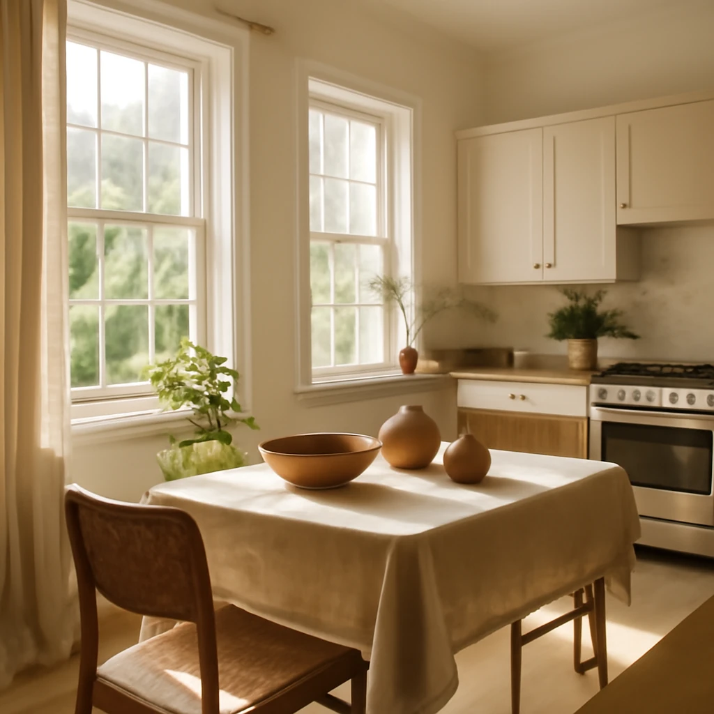
Light Kitchens Across Europe: Colour, Texture and Style
Why choose light kitchens
Light palette kitchens remain a timeless proposition across European homes. They reflect daylight, visually extend the room and harmonise with a wide range of interior directions. Yet if not thoughtfully styled, they can feel clinical or sterile. The aim is to use white, grey and beige tones in a way that feels fresh, warm and practical for everyday life.
Pros of light-toned kitchens
- Visual expansion. Light colours reflect more daylight, helping compact kitchens read as more generous and open.
- Impression of cleanliness. Bright surfaces evoke a sense of cleanliness, a valuable association for any kitchen space.
- Cost considerations. In many European markets, white melamine or lacquered MDF facades can be more economical while delivering a refined, contemporary look.
- Compatibility with other finishes. A light backdrop accepts a wide range of textures, from warm timber accents to bold colour pops.
- Style flexibility. Light kitchens work well with both classic and contemporary interpretations, making them a durable foundation as tastes evolve.
Cons of light-toned kitchens
There are a few drawbacks, but with thoughtful planning they are easy to mitigate.
- Maintenance considerations. Lighter surfaces reveal smudges and fingerprints more readily, so timely cleaning after cooking is advisable to keep the look pristine.
- Risk of monotony. Without texture and contrast, a light kitchen can feel flat. Layering materials and varying light levels are essential to avoid a sterile atmosphere.
How to design a light-toned kitchen for Europe
Designing light kitchens is about balancing brightness with tactility and warmth. Start with foundational decisions and then introduce texture, colour and lighting to suit the room and lifestyle.
Wall finishes - neutral and sophisticated
In most European kitchens walls are painted in soft neutrals or clad with understated wallpapers. A slight tonal variation between wall colour and cabinet finish is natural, even when both are light. The difference arises from textures and light reflection: wall paint and cabinet veneers absorb and reflect light differently, creating subtle depth rather than flat surfaces.
Flooring - contrast for depth
Light kitchens accommodate a wide range of floor coverings. Wood-look planks, porcelain or composite tiles that mimic natural timber pair especially well with light walls and cabinetry. When aiming for a serene, almost monochrome space, a very light timber or pale stone floor keeps the environment airy. If more drama is desired, a darker floor can work, but it will require careful balancing with cabinetry and furniture to avoid heaviness.
Patterned or textured flooring can provide focal interest while remaining anchored in a light palette. In European homes with compact footprints, a subtle pattern can delineate zones for cooking, dining and preparation without creating visual clutter.
- Note that lighter interiors benefit from strategic accents to anchor the space without overpowering it.
- Consider underfloor heating compatibility when choosing flooring materials for comfort throughout the year.
Cabinetry - the base for accents
Cabinetry forms the backbone of a kitchen, in a light scheme it can recede into the backdrop or act as a stage for colour and texture. A uniform light unit can be complemented by darker worktops or lighter uppers, depending on the mood you want to create. A light base with a contrasting countertop often achieves a contemporary, tactile effect, while an all-light scheme can feel clean and serene.
Appliances - colour coordinated or statement pieces
In a low-contrast light kitchen, white or grey appliances blend in, keeping the space cohesive. If a touch of drama is desired, black appliances or a dark accent can be integrated with other elements in the room, such as lighting fixtures or a dark dining table edge.
Furniture and decor - neutral or vibrant
Furniture and decor should reflect the desired ambience. Light kitchens frequently feature timber-topped tables and chairs, with either white or darker storage and seating. To brighten the space further, introduce accent decor in saturated hues such as mustard, teal, sage or terracotta. The key is restraint: a few carefully chosen objects are more effective than a cluttered display.
Which colour to choose for a light kitchen
Light does not equate to white alone. Grey and beige tones, or a pastel palette, can achieve a refined, welcoming look. Each option carries its own character and practical considerations. Here are the primary routes you can pursue.
Monochrome light kitchens
For monochrome light kitchens walls and cabinetry often share a similar light hue, with deeper greys or blacks used for accents. The objective is to preserve airiness while allowing a bold colour to appear on countertops, splashbacks or hardware. The drawback is that any bright colour can feel busy if storage and organisation are not given priority.
Pastel tones
Pastel palettes offer a gentle way to brighten a kitchen. Soft blues, greens, pinks and mint hues can appear on cabinetry or wall surfaces, paired with lighter countertops for balance. A pastel scheme often works best when uppers and lowers alternate or when lighter tones are balanced by white or grey elements.
White plus marble plus wood
A lighter variant combines white with a marble-inspired worktop and timber details. With minimal use of dark elements, the space reads as contemporary luxury while remaining practical for daily use. Timber brings warmth and tactility to avoid a clinical feel.
White plus grey with gold details
Gold or brass hardware and lighting can lift a white or grey kitchen, adding warmth and a touch of timeless refinement. Use metallics sparingly to avoid overpowering the space, the aim is a nuanced glow rather than a flash of opulence.
Shades of grey
Cool greys suggest a modern, industrial mood, often with marble or concrete textures and black accents. Warmer greys suit Nordic and contemporary classic aesthetics, paired with black, white or timber, and a mix of matte and polished finishes to create depth. Lighter greys read as calm and sophisticated, while mid-tones add architectural presence without heaviness.
Colour strategy and practical considerations
When combining whites and greys, consider the room’s light. North-facing spaces benefit from warmer whites to prevent an austere feel, while sunlit rooms can tolerate cooler tones. Maintenance matters too: lighter schemes reveal more smudges, so plan for easy-to-clean surfaces and practical storage to keep counters clear.
Texture and finish options for light kitchens
Texture is essential to prevent light kitchens from feeling sterile. The choice between glossy and matte surfaces significantly affects how light interacts with the room.
Glossy details
Glossy facades have fallen out of fashion since the mid 2000s due to strong reflections and fingerprints. However, elements made of glass, acrylic or polished stone can provide strategic reflectivity without dominating the overall aesthetic. If shine is desired, consider a polished countertop, a glass splashback or transparent seating materials to catch light in a refined way.
Matte finishes
Matte surfaces remain a cornerstone of contemporary kitchens. Budget-friendly laminates can achieve a soft white matte finish, while higher-end options offer super-matte or velvet textures that feel luxurious but require careful maintenance. In homes with children or frequent staining agents, choose coatings that are easy to clean and resistant to marks.
Which design style suits a light kitchen
Light kitchens pair well with many stylistic directions. The trick is to establish direction through details rather than colour alone.
Classical refinement
In classical-inspired schemes you might incorporate moulded cabinet doors, refined hardware and natural stone worktops. The light base can be complemented by soft greys or warm creams, with subtle bronzes or golds. Even modern reinterpretations can reference classical cues through proportion and material quality rather than overt ornament.
Modern and contemporary interpretations
Contemporary kitchens often favour flat-front cabinets and neutral handles. Glass-front drawers can add lightness, while integrated appliances create clean lines. When designing for a European home, consider a palette that leans towards warm or cool neutrals and ensure consistency across materials such as countertop, tile and hardware.
- Scandinavian style pairs light cabinetry with timber worktops and white wall tiles for a tranquil, bright kitchen.
- Japandi influences bring warm wood tones together with pale ceramics and soft textures to evoke a calm, hygge-inspired simplicity.
- Industrial or loft-inspired schemes introduce concrete textures, lighter timber and kitchens rendered in pale greys for an urban yet breathable atmosphere.
Common design mistakes in light kitchens
Steering clear of common missteps helps ensure the light kitchen remains practical and inviting rather than merely pretty.
All in one colour
Monochrome schemes can devolve into flatness if tone and texture are not varied. The main hue should be accompanied by a deeper shade and a contrasting material or hardware finish. A few strong contrasts can energise the space while preserving brightness.
Over-contrast without nuance
Pure white with black accents can feel severe if other colours or textures are missing. Introduce greys, warm timber or coloured textiles to soften the contrast and create a comfortable, lived-in atmosphere.
A few final thoughts
Choosing and arranging light kitchens involves practical and perceptual considerations. Here are essential takeaways to guide your project.
- Light kitchens are ideal for smaller spaces, bringing airiness and a sense of openness to the room.
- A light palette works with almost any interior direction, the style emerges through characterful details rather than colour alone.
- To avoid sterility, introduce depth with multiple textures and materials across cabinetry, countertops and flooring.
- Accents in black or colour can make a light kitchen feel modern and dynamic while maintaining brightness.
- Matte finishes are currently more on trend than gloss, if you prefer shine, use polished elements and glass as focal points.
- Think about organisation and storage to keep surfaces clear and preserve a sense of space.
- Plan lighting carefully, combining ambient, task and accent lighting to satisfy function and mood.
- Choose durable materials suitable for European climates and family life, balancing performance with aesthetics.
You may also like these articles
Designing a European Country Home: Spaces, Styles and Practical Planning
Timeless ideas for cosy, practical European country homes.
Pantograph Sofas: A Practical Guide to Daily-Use Transforming Comfort
How pantograph sofas fuse comfort, storage and daily sleep.
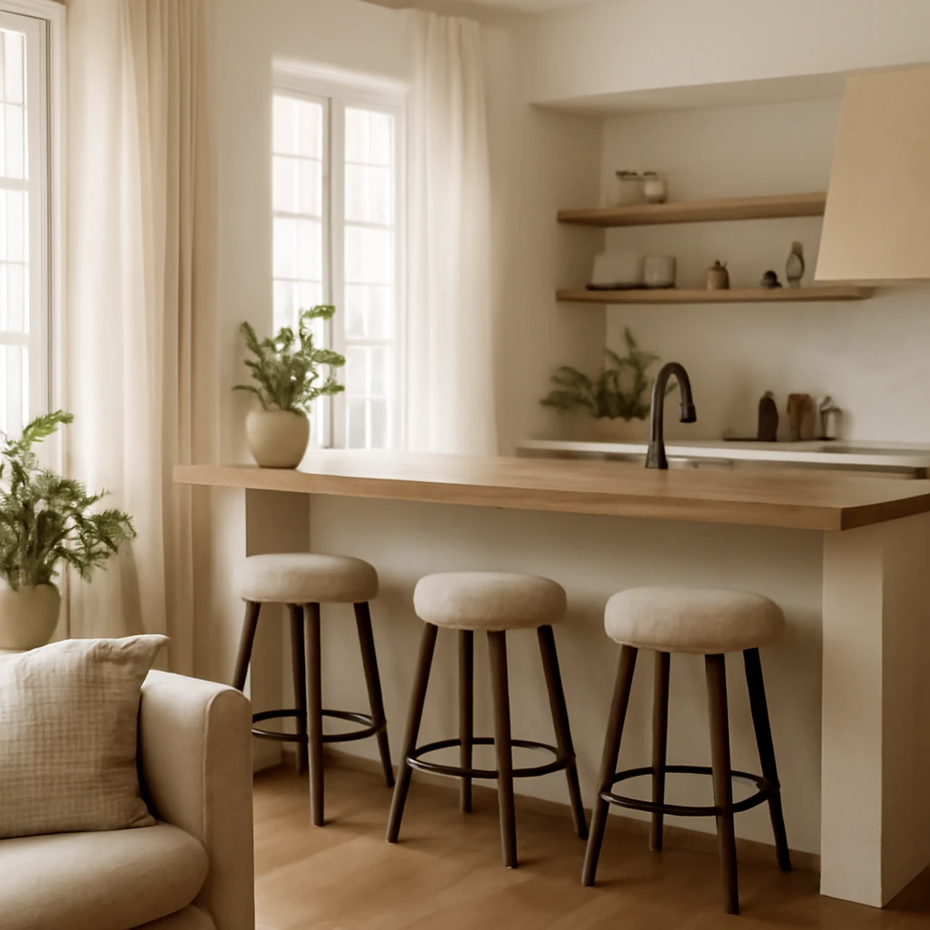
Bar Counters for Kitchen and Living Spaces: Design Ideas Across Europe
Smart bar counters redefine kitchens and living spaces with style and space-saving versatility.