
Explore interior trends, AI design insights, styling guides and real transformations
How to Mix and Match Wallpapers: A European Guide to Layered Walls
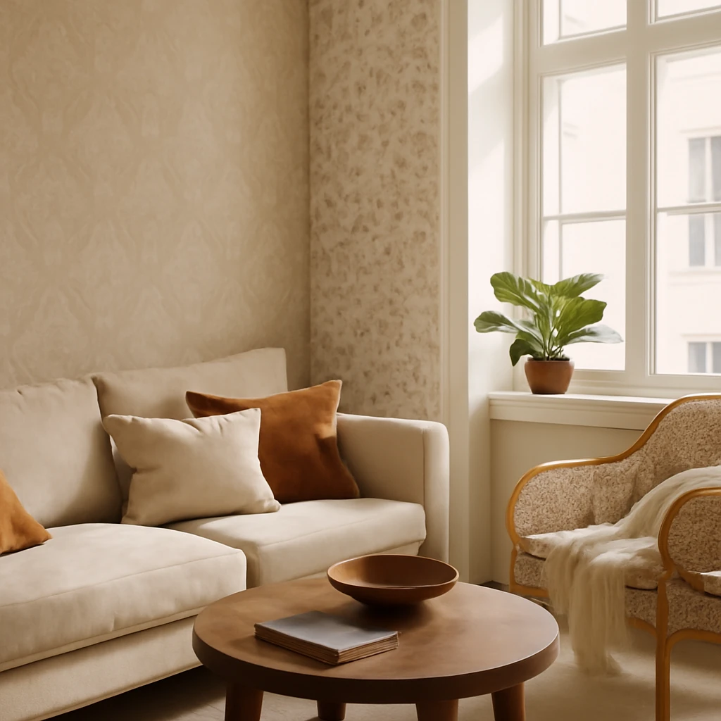
Introduction
Wallpaper remains one of the most versatile tools in a designer’s toolkit. A well-chosen collection offers a spectrum of scales, textures, and moods: from large, expressive prints to delicate geometrics, from tactile textures to quiet plains. The challenge is not choosing the patterns at all, but translating a sample board into a harmonious space that feels authentic and timeless. In European homes - from compact city apartments to light-filled open plans - the way walls relate to light, furniture, and architectural detail matters as much as the pattern itself. This guide provides practical strategies for mixing wallpapers of two or more colours and designs, across walls, alcoves, ceilings, and architectural features.
What follows blends a considered approach to scale, proportion, and texture with a flexible mindset. You’ll learn how to identify accent zones, how to balance bold prints with calmer backgrounds, and how to create a cohesive scheme when combining wallpapers from different collections or manufacturers. The aim is to help you craft interiors that feel curated rather than cluttered, and vibrant without becoming overwhelming.
Three principles for arranging different wallpapers in a room
1. Define accent walls
Think of the room as a stage and your walls as the scenery. Accent walls are the surfaces that are most visible from the entrance or that naturally draw the eye when you sit or stand in the space. In European homes, certain zones are particularly suited to stronger colour or busier patterning:
- walls that are first seen on entering the room;
- areas behind a television, fireplace, or seating arrangement;
- the wall behind a sofa in living rooms, kitchens, or home offices;
- the wall behind the dining table;
- the headboard wall in bedrooms or children's rooms.
Additionally, architectural features can become focal points. Consider walls with alcoves, niches, deep recesses, cornices, archways, or varying ceiling heights as opportunities to create a visual moment that complements the broader scheme.
Do not apply accent wallpaper on more than two zones. If you overdo it, the walls will compete with each other and the room will feel busy rather than coherent. If a space is small or lacks distinctive architectural details, favour two or three calm designs instead of bold statements. These might be
- soft, understated backgrounds;
- a restrained pattern or geometry in a muted palette paired with a background of similar visual weight;
- two calm patterns in identical design family but in different scales - one larger, one smaller.
2. One wall, one design
Avoid stitching several different wallpapers on the same wall. Instead, run each wallpaper from corner to corner, following the line of any architectural element such as a niche, alcove, or recess. If you do want a central feature, frame it with a delicate moulding or choose a companion wallpaper whose background is not highly contrasted. That way the transition feels intentional rather than frenetic.
3. Do not use more than three designs from a collection
Variety is essential, but too much of it can fragment a room. If you mix more than three designs, ensure they share a common tonal language and roughly equal visual weight. When possible, group related designs into zones or use them to punctuate different areas of a large space to maintain a coherent whole.
How to combine wallpapers: popular methods
Background + background
The most serene pairing is two or three calm backgrounds in varying lightness and strength of colour. For example, a mid-gray paired with a charcoal or a warm taupe with a lighter beige, or a greens palette with a grown, slightly darker counterpart. The aim is to amplify depth without creating visual noise. Another option is to assemble a duo or trio consisting of one or two very quiet colours with a single punchy accent. Let the brighter hue occupy a smaller area to maintain balance.
Background + pattern or geometry
This classic pairing remains reliable for achieving even walls with an eye-catching focal point. If you prefer homogeneous, low-key walls, choose companions with the same background for flat or subtle backs. If contrast is preferred, select a companion that is notably lighter or darker than the background. Traditionally, patterned or geometric wallpapers are used on accent walls or parts of walls, however, you can reverse the approach by wallpapering a niche or a recess with a calmer background and letting the more active surface sit around it. In such arrangements, avoid covering the entire room with a bold print - limit the application to the wall that houses the niche or element.
When pairing a large-scale print or a bold motif with a background, ensure the smaller piece serves as a quiet backdrop, enabling the large print to read clearly without competing for attention.
Large print or geometry + the same in a smaller scale
Be aware that large prints visually shrink surfaces, while small patterns can make spaces feel larger. For accent walls, reserve the large-scale print or bold geometric for one surface, and let the smaller version act as a supporting field. The visual weight of the smaller pattern should be modest enough to anchor the overall composition without stealing focus from the primary feature.
Pattern + geometry
These combinations work beautifully in classic interiors where a geometric motif (often a stripe or grid) accompanies a patterned surface such as damask or florals. Choose geometries that are calm and unobtrusive, a restrained stripe or a subtle lattice can structure the space without becoming tiresome. This pairing is also effective with photographic wallpapers containing soft floral motifs, especially when combined with a plain or striped element to maintain legibility and rhythm.
Two or three different patterns
In more complex schemes, proportion is key. The more active the design or colour, the fewer such wallpapers should appear in the room. To achieve cohesion, opt for patterns with similar intensity and visual weight, and distribute them thoughtfully around the space. Practical approaches include:
- placing accent wallpapers as decorative insets within mouldings;
- distributing patterns around the room to counterbalance angles and alcoves;
- cladding the internal sides of a bookcase or cabinet with a wallpaper twist for moments of surprise and texture.
Other options for combining wallpapers
How to combine wallpapers horizontally
A popular design technique is to use a wallpaper as a tall border or a colour-contrasted band along the wall. This is not the same as clipping a strip of old-style borderboard, it’s a refined reference to classic detailing in a contemporary home. A horizontal band can visually elongate a room or provide a colour cue that ties different surfaces together.
How to combine wallpapers on walls and ceilings
Extending a wall design to the ceiling can create a unified, atmospheric effect. The key is to keep the ceiling pattern visually lighter and less busy than the walls, a busy ceiling can feel heavy and close the space. When the ceiling is darker or busier, it tends to recede, making the room feel lower. If you choose a ceiling design that mirrors a wall colour, ensure there is enough contrast to avoid a flat, monotone look.
How to properly combine wallpapers from different brands, collections and materials
Mixing wallpapers from multiple manufacturers or collections is possible, but it requires care. Each brand has its own undertone, texture, and surface sheen. In practice, if a single project necessitates mixing, look for surfaces with compatible textures and similar light reflection (sheen). If a textile wallpaper is involved or a very delicate surface, reserve it for a feature zone and pair it with a more durable vinyl or non-woven wallpaper for high-traffic areas. When pairing disparate surfaces, consider the following strategies:
- distribute disparate textures across different walls to let light fall on each surface differently, making the transition less noticeable;
- use mouldings to visually separate the designs and create clean delineations between zones.
Another useful approach is to assign each wallpaper to a dominant wall in a room with a generous geometry, such as a long corridor or a square living area. This helps the eye travel naturally through the space and reduces the perception of abrupt changes. You can also create a deliberate focal feature by wallpapering the back of a built-in bookshelf or display cabinet with a contrasting pattern, then keeping surrounding walls calmer to maintain legibility.
How not to mix wallpapers: 3 outdated methods
- alternating designs on every other strip across a wall,
- matching multiple wallpapers horizontally in equal proportions without considering scale or weight;
- placing an accent wallpaper so that the edge-to-edge distance on the wall leaves less than 20 centimetres of plain wall beyond the wallpaper.
These approaches tend to look dated or chaotic, particularly in contemporary European interiors where light, proportion, and texture are used to guide the eye. When in doubt, step back and assess how the colour and pattern work with furniture silhouettes, rug scale, and natural light. Subtlety is often the virtue of enduring interiors.
Practical tips for a cohesive wallpaper scheme
- Understand the room’s lighting: northern light tends to cool, while southern light warms, choose wallpapers with undertones that align with the room’s daylight or artificial light.
- Consider the furniture and flooring: opt for underlying tones in the wallpaper that harmonise with wood floors, stone, or ceramic finishes.
- Test scale with room geometry: a small-scale pattern can read as busy in a tiny space but can be perfectly fine on a tall wall in a larger room.
- Think about maintenance: if the room is used by families or pets, choose durable materials such as vinyl-coated or non-woven wallpapers in high-traffic zones and consider full-wall wallpaper on surfaces with less wear.
- Plan for future flexibility: design schemes that allow swapping one wall’s wallpaper for a new pattern without requiring a complete overhaul of the room.
- Balance colour across surfaces: a limited palette with two or three core hues helps unify multiple patterns while preserving visual interest.
Final thoughts: designing with wallpaper in European homes
Wallpaper offers remarkable flexibility, enabling designers and homeowners to craft rooms with depth, texture, and visual rhythm. The European context - characterised by diverse architectural languages, bright natural light in many interiors, and a mix of historic and contemporary furnishings - lends itself to layered wallpaper strategies. Start with clear priorities: identify the accent zones, establish a modest background, and then weave patterns that support architecture rather than overwhelm it. When done with care, a multi-pattern wallpaper scheme can feel both sophisticated and distinctly personal, a reflection of the room’s function and the people who use it.
If you found this guide useful, share it with colleagues and friends who are rethinking their walls. A well-considered wallpaper plan can transform a room from ordinary to evocative, without sacrificing calm or comfort.
You may also like these articles
 Kitchen Design
The Kitchen Island: A Complete Guide to Planning, Layouts and Styles Across Europe
A practical guide to planning and styling kitchen islands in European homes.
Tips & How-To
A Practical Yearly Deep Clean: The Essential European Guide
Plan a seasonal, thorough annual clean to refresh every corner of your European home.
Small Spaces
Storage in the Bathroom: Principles, Zonal Solutions and Real‑World Projects
Smart storage strategies for compact European bathrooms, with expert tips and real projects.