
Explore interior trends, AI design insights, styling guides and real transformations
Pop-Art Interiors: A Bold Guide to Colourful European Living
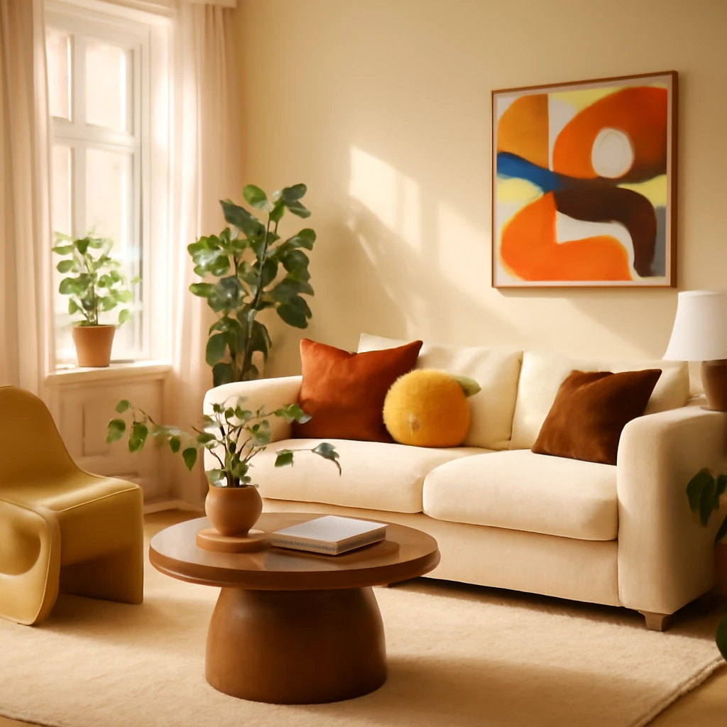
Pop-Art interiors: a bold, joyful expression for European homes
If you’re seeking to transform a flat into a vivid, witty and unmistakable object of art, Pop-Art is a compelling destination. It is a design language that revels in mass culture, high contrast and playful rebellion against the ordinary. This article delves into the key characteristics of Pop-Art interiors, weighs the pros and cons, and offers practical, European-friendly ideas drawn from contemporary projects. It will show how a Pop-Art approach can be both a statement and a cohesive living environment when executed with balance and restraint.
Origins and evolution of Pop-Art in interiors
Pop-Art emerged in the mid-20th century as a reaction against the exclusivity of abstract expressionism. Artists sought to make art accessible, drawing inspiration from advertising, comics and everyday objects. In interior design, Pop-Art translates this democratic impulse into spaces that feel energetic, witty and recognisably contemporary. In European homes today, the style is less about shouting walls and more about a considered play of colour, form and texture. The goal is to create spaces that feel like a personal gallery - bold, but not overwhelming - a place where everyday life becomes artful and joyful.
What defines Pop-Art in interior design?
Pop-Art interiors blend a love of popular culture with strong, graphic design. Typical features include:
- Contrasting colour palettes that pair high‑saturation tones with neutral backdrops;
- Original and sculptural furniture pieces that function as art objects;
- Modern materials - glossy plastics, clear glass, metallic accents, concrete and stone - that convey a contemporary edge;
- Re-contextualised everyday items treated as design statements, such as eccentric lighting, furniture with graphic upholstery, or decor that mimics comic-book graphics;
- Decor in the form of photo-collage aesthetics or hyperbolic posters, drawing on iconic imagery from mass culture.
In European interiors, Pop-Art often blends with adjacent modish movements - neo‑memphis, dopamine décor or mid‑century influences - while remaining anchored in a clean, breathable backdrop to prevent visual overload. It is possible to enjoy the mood of Pop-Art without sacrificing comfort or practicality by selecting a few key elements and letting them breathe within quiet, well‑balanced spaces.
Pros and cons of Pop-Art interiors
Before diving into a bold transformation, it pays to weigh the positives and drawbacks.
Pros:
- Energy and optimism. A Pop-Art space can lift mood and inspire creativity, making daily routines more enjoyable.
- Uniqueness. The style readily creates interiors that feel distinctly personal and memorable.
- Self-expression. The room becomes a reflection of interests and personality, rather than a conventional blueprint.
Cons:
- Risk of visual overload. It’s easy to overdo colour and form, careful zoning helps maintain balance.
- Emotional intensity. Constant brightness can be tiring, design in zones of calm alongside high‑impact areas.
- Not universally suited. The aesthetic tends to suit energetic, extrovert lifestyles and spaces with good light - careful planning is essential for smaller or darker dwellings.
When executed with discipline, Pop-Art can be both exhilarating and highly liveable. A well-chosen sofa, a standout lighting piece and curated artworks can anchor the scheme and prevent it from tipping into visual chaos.
Colour palette for Pop-Art interiors
Colour is the primary engine of Pop-Art. The palette should feel clean, saturated and often a touch playful or acid-bright. Typical choices include:
- Crackling pinks (think bold magenta), electric oranges, lemon yellows and ultramarine blues;
- Core neutrals - black and white - as a stabilising backdrop for vivid accents;
- Strong primary reds to punctuate key moments in the room.
Pure Pop-Art is uncommon, more often, the style sits within a dialogue with related movements and neutrals, allowing accents to stand out against a calm, restrained field. The result is a space that feels exciting yet sophisticated, with details that reward closer inspection.
Forms, textures and finishes
Geometry and exaggeration are at the heart of Pop-Art form-making. Angles may be softened or deliberately distorted, echoing comic-book aesthetics. In terms of texture, the glossy finish is a defining feature - the sheen of plastics, glass, lacquers and chrome helps to create a dynamic, light-filled environment. Pairing high‑gloss surfaces with tactile textiles and graphically printed upholstery adds depth without dulling the impact of colour.
- Geometric shapes and sculptural furniture that read as art.
- Glossy materials as reflective surfaces to bounce light and enhance contrast.
- Layered textures - velvet cushions, ribbed fabrics, and graphic wallpapers - to create visual interest at different scales.
Finishes and surfaces: walls, floors and ceilings
To realise a Pop-Art look, surface treatment plays a pivotal role. Each element should support the overall energy while keeping the scheme cohesive.
Walls
The wall is the dominant canvas for Pop-Art expression. Practical options include:
- Single-colour backdrops in white, graphite, or soft neutrals to let accents sing.
- Wallpaper with large-scale portraits, comics or collage motifs to create a focal wall.
- Graphic graffiti or faux‑Lichtenstein-inspired detailing as a modern mural.
- A gallery wall of slim-profile posters framed in light, minimal frames.
The wall can set a refined stage for bold features elsewhere, so balance is essential to avoid a “market stall” impression.
Flooring
Floor finishes should be practical yet expressive. Consider:
- Glossy resin or epoxy floors in neutral tones to reflect light and enhance colour accents.
- Geometric or graphic-patterned carpeting for tactile warmth without diminishing the impact of the walls.
- In bathrooms or hallways, bold ceramic tiles or statement tiles used as accents against a more muted field.
Ceiling
The ceiling is your fifth surface - use it to extend the Pop-Art mood:
- High-gloss ceilings to amplify light and colour interaction.
- Perimeter concealed lighting or a neon feature in a central plane for a theatrical effect.
- Consider painting the ceiling a saturated hue in smaller spaces to create intimacy and drama.
Furniture: choosing pieces that double as art
Pop-Art interiors benefit from openness, so avoid clutter and prioritise deliberate, well-considered pieces. Embrace minimalism in form and material while making room for statement furniture that acts as sculpture.
- Built-in wardrobes and integrated storage to maintain clean sightlines, consider a walk-in wardrobe in larger flats for a streamlined look.
- Sofas with sculptural silhouettes and bold colours or unusual upholstery, frame or no-frame options can be bold choices.
- Designer chairs and stools with distinctive shapes or graphic prints, occasionally they function as stand-alone art objects.
- Glass coffee tables, or those with metal or wood accents, to keep the space feeling light and open.
- Low-profile storage with rounded or retro‑inspired forms that echo the 1960s mood.
In this style, special pieces become focal points: a bed frame inspired by a vintage vehicle, a side table that resembles a suitcase, or a cabinet crafted from reimagined public signage. The key is to curate a few high-impact items rather than fill the space with similar distractions.
Decor and textiles: the finishing touches
Details are where the Pop-Art personality truly reveals itself. Strategic choices create a coherent, energetic environment without overwhelming the senses.
- Posters and reproductions of iconic Pop-Art works or celebrities, framed elegantly.
- Sculptures and figurines that reference mass culture, arranged with intent rather than randomness.
- Neon signs featuring quotes or symbols that reinforce the playful tone.
- Textiles with comic-book prints or bold graphics: cushions, rugs, and curtains in bright colours or strong contrasts.
Lighting: making light a design feature
Lighting is a powerful tool for establishing focal points and mood. In Pop-Art interiors, lighting should read as art itself as well as illumination.
- Light fittings and lamps that are sculptural or feature vivid colours can become sculptural artworks in their own right.
- Neon lighting is a classic Pop-Art element, ideal for creating a vibrant atmosphere around seating or art walls.
- Recessed spotlights and track lighting help to highlight key objects and avoid flat lighting across the room.
Room-by-room ideas: applying Pop-Art in European homes
Below are practical concepts for several common spaces. Adaptation to your footprint and light conditions is essential to keep the look balanced and functional.
Kitchen
For a more pared-back Pop-Art effect, use a vivid primary colour as the base for cabinetry or an accent island, with a neutral backdrop to temper the intensity. A graphic splashback - such as a comic-strip motif or a bold mosaic tile - can act as the signature feature. Choose seating with a clean line and a playful colour, and apply restrained detailing to keep the kitchen practical and easy to live with.
- A compact, bright dining table with chairs in contrasting colours can anchor the space without overwhelming it.
- Flooring should be durable and easy to clean, consider a subtle geometric pattern in a resilient finish.
- Lighting over the workspace should be bright and crisp, combining function with a touch of whimsy in pendant forms.
Living room
The living room is the natural hub for Pop-Art energy. Focus on one dominant statement piece - an oversized sofa or a sculptural chair in a saturated hue - paired with a calmer backdrop. A gallery wall of bold posters or a single large-scale canvas inspired by comic-graphics can define the room. Keep other furniture simple, with smooth lines and neutral finishes to allow the main accents to sing.
- Consider a neutral sofa dressed with cushions in a spectrum of bright tones to create a controlled, layered effect.
- Add a coffee table with a glass top over a base in a vivid colour or graphic silhouette.
- Use lighting to create theatre: a statement floor lamp or a design-centric chandelier can unify the room.
Bedroom
To prevent the sleeping space from becoming too chaotic, select one feature wall for a striking wallpaper, mural or photo collage, and keep bed linens tactile but bold in one well-chosen colour. A neon night light or a sculptural bedside lamp can provide subtle pops of energy without disturbing rest.
- Choose a bed frame with a distinctive shape or a colour that anchors the palette.
- Soft furnishings in satin or velvet with graphic prints add depth and warmth.
- Keep storage sleek and discrete to maintain calm and orderliness.
Children’s room
Pop-Art is particularly appealing in children’s spaces where colour and playfulness support imagination. Use bright wall colours or murals and incorporate furniture with rounded shapes and non-slip finishes. Allow room for artwork and prints that reflect playful characters and friendly imagery while ensuring the room remains functional for study and rest.
- Low storage units and modular shelving that can evolve with a child’s interests.
- Adopt a theme that can be updated with changeable textiles and removable decals.
- Durable finishes and easy-to-clean surfaces are essential in high-energy spaces.
Bathroom
Pop-Art can translate beautifully into the bathroom with a bold tile layout, a brightly coloured vanity or a striking mirror frame. Water-resistant artwork or murals that fit within the space’s moisture considerations can add humour and personality. If you prefer a more budget-friendly approach, use colourful tiles or a graphic pattern on one wall, paired with white or light-grey walls elsewhere.
- Consider one vivid focal piece - an accent tile or a brightly framed art print behind the bath or basin.
- Non-slip flooring with a graphic edge keeps practicality intact while adding style.
- Neutral plumbing fixtures with colour-pop accessories create a balanced, contemporary feel.
Hallway and entrance
The entrance is critical for setting the tone. A console with an unusual silhouette, a large mirror in an unusual frame, and a neon phrase on the wall can establish the Pop-Art mood instantly. Keep other surfaces minimal to maintain a strong first impression without clutter.
- A compact bench or pouf in a bold colour invites guests in with a friendly gesture.
- Reflective surfaces help to maximise light and create a sense of space in narrow foyers.
- Typography or graphic signage can be a witty, welcoming cue as you step inside.
Home office or study
In a work space, Pop-Art can stimulate creativity when balanced with focus. Use a single bold colour on one wall or in select furniture pieces, while keeping the desk area clear and well organised. A bright, ergonomic chair or a sculptural desk lamp can act as a central design element without compromising functionality.
- A primary-colour task chair or a vibrant accent wall supports energy without distraction.
- Floating shelves in a contrasting finish offer storage with a strong visual identity.
- Task lighting with a design-led profile helps maintain a productive environment.
Putting it all together: a balanced Pop-Art approach
Success in Pop-Art interiors comes from moderation and thoughtful curation. The aim is to fuse energy with comfort, turning living spaces into places that feel both dynamic and welcoming. Consider the following practical guidelines:
- Select a maximum of two or three dominant colour families and use them consistently across rooms to maintain cohesion.
- Pair high-impact furnishings with calm, neutral backdrops to create visual breathing room.
- Prioritise scale and proportion. Oversized art or furniture can dominate a small space, in compact dwellings, focus on one striking feature per room.
- Balance glossy, reflective surfaces with tactile textiles to add depth and warmth.
- Plan lighting to highlight focal pieces and to offer daily practicality for living, working and relaxing.
Frequently asked questions
What colours and patterns are most characteristic of Pop-Art interiors?
Core colours include pure, ultra‑bright tones such as acid pink, lemon yellow, red, blue and orange. These are typically used as accents against a neutral (often black-and-white) backdrop. Patterns frequently feature polka dots, bold stripes, geometric prints and stylised portraits or mass-culture graphics.
How does Pop-Art mix with other styles?
Pop-Art sits well with dopamine-inspired decor and with mid‑century or Neo‑Memphis aesthetics. It pairs poorly with traditional or very neutral interiors where the high-contrast, graphic language fights with conservative finishes. The key is to maintain a few anchors - one bold sofa, a neon sign, a single gallery wall - and ensure the rest of the room remains restful and legible.
How can I incorporate Pop-Art into my space without compromising comfort?
Prioritise functionality and storage. Choose high-impact pieces that can be used in everyday life, not just displayed as props. Use neutral walls and ceilings to temper intensity, and apply colour and graphics through textiles, lighting and small accessories. A single statement piece can be enough to establish the vibe, with the rest of the room behaving as a quiet stage.
What about artwork and decor in Pop-Art interiors?
- Use large-format posters or canvases with iconic imagery as focal points.
- Incorporate sculpture and designer objects that reference mass culture while maintaining refined materials and workmanship.
- Neon signs or quotes add a playful layer, ensure they don’t dominate the room when off.
In sum: key takeaways
- Pop-Art offers bold, joyful design rooted in popular culture, translated into practical European interiors.
- Core to the look is a disciplined palette, graphic forms and high‑gloss finishes that read as contemporary rather than retro pastiche.
- Function should never be sacrificed. Minimal, well-chosen furniture and clever storage are essential for liveability.
- Balance is the friend of Pop-Art: allow spaces to breathe with calmer backdrops while placing one or two artful, high-impact features at the centre of attention.
- With thoughtful planning, Pop-Art can be a timeless, adaptable language for modern homes across Europe.
Final note: building a Pop-Art room-by-room
A Pop-Art mood can be integrated incrementally. Start with a single bold feature - the wall, a statement sofa or a striking light - and observe how it shifts the space. Gradually introduce complementary accents, textures and soft furnishings in aligning hues. The beauty of Pop-Art lies in its ability to evolve: a living room can be bright and playful today, and in a few years, the same room can be reinterpreted with different graphic motifs or swapped textiles to refresh the atmosphere while preserving the core character. For designers working within a European context, the challenge is to maintain an energetic yet harmonious living environment that respects the home as a sanctuary as well as a vivid canvas for daily life.
You may also like these articles
 Living room
How to size a sofa for a European living room: comfort, fit and function
Master the art of sofa sizing for stylish, well-proportioned living spaces.
Interior Design
Country-Style Interiors: Timeless European Charm for Rural Homes
Embrace rustic warmth with European country style.
Renovation
Design-Driven Apartment Renovation: A Practical Guide
A practical blueprint for smart, stylish apartment renovations across Europe.