
Explore interior trends, AI design insights, styling guides and real transformations
Wallpapers in 2026: A design-forward guide for European interiors
Wallpaper trends for 2026 in European homes
In Europe, wallpaper has moved beyond mere decoration, it is a strategic material that can correct proportions, zone spaces, and add tactile texture. Modern wallpapers are more durable, washable, and easier to install than ever before, thanks to advances in substrates and coatings. They provide a broad canvas for colour and pattern while offering practical benefits such as hiding minor wall defects and resistance to humidity when chosen with appropriate materials. Designers and homeowners alike are embracing a spectrum of styles, from painterly monochromes to bold geometric prints and nature-inspired textures, to create interiors that feel contemporary yet timeless.
- Wallpaper substrates have evolved to be more breathable and washable, making them suitable for living rooms, corridors and kitchens when chosen correctly.
- Durable finishes, including vinyl and non-woven backing, provide longevity in high-traffic zones and damp-prone areas.
- Textures that imitate natural materials - linen, plaster, stone or wood - offer depth without heaviness on the eye.
- Large-scale patterns create drama in generous spaces, while small-scale motifs work well in cosy rooms or apartments with low ceilings.
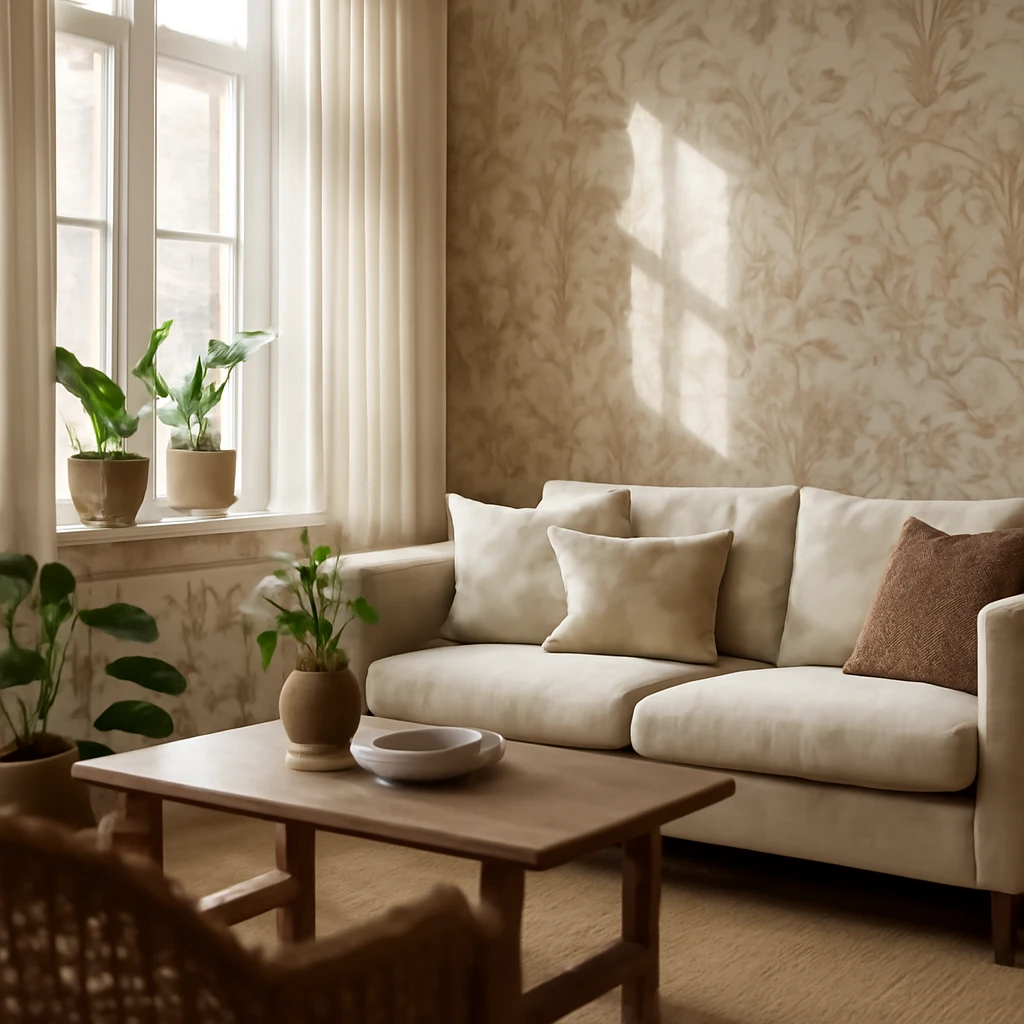
Monochrome wallpapers with a paint-like finish
Painted walls became an instinctive choice for smooth, uniform finishes. Today’s wallpapers replicate the painterly effect with precision: flat, matte or satin textures that imitate freshly painted surfaces while delivering stability and ease of maintenance. These options are ideal for hiding minor plaster irregularities or hairline cracks that can appear with age, without sacrificing the crisp, contemporary look. In European homes, non-woven backings with breathable adhesives ensure durability and comfortable handling during installation, while wide rolls and seamless joins reduce visual interruptions in open-plan spaces.
- Choose wallpapers with a true matte or soft satin finish to emulate flawless paintwork.
- Pair monochrome textures with warm woods or soft textiles to maintain warmth and cosiness.
- Layer with natural materials and tactile fabrics to avoid a sterile, clinical feel.
Abstract or geometric prints
Global design currents are revisiting modernist language through dynamic prints and bold geometry. In contemporary interiors, these motifs convey movement and energy through colour, line and form. Stripes, zigzags, diamonds and triangles can alter spatial perception, especially when scaled thoughtfully to room size. In larger rooms, oversized geometric patterns offer drama, in compact spaces, smaller motifs provide visual texture without overwhelming the senses. The key is harmony: align the chosen palette with existing flooring, furniture and textiles so the whole room reads as a cohesive composition.
Abstract and geometric patterns are particularly effective for shaping perception:
- Vertical stripes visually raise ceilings and expand wall height, creating a sense of airiness.
- Diagonals and chevrons introduce dynamism and can suggest movement through the space.
- Repeating motifs should be scaled to the proportions of the room and checked against furniture silhouettes to avoid visual competition.
Plant and animal patterns
Botanical and animal-inspired wallpapers remain a favourite, but with a refined, contemporary interpretation. The trend favours detailed yet subdued illustrations in natural colours, avoiding the retro or overly saturated looks of the past. Large, muted motifs can act as a feature without dominating the room, while smaller botanicals provide a soft, intimate backdrop. These patterns pair beautifully with timber elements, rattan furniture and earthy textiles, or with cool, contemporary materials like glass and steel to create a balanced, modern environment.
- Opt for nature-inspired palettes: soft greens, terracotta, warm greys and cream hues.
- Use botanical prints as focal walls or subtle accents rather than overwhelming an entire apartment.
- In humid areas, select fabrics and finishes with robust washability and fade resistance.
Natural textures and materials
The appeal of natural materials has grown in response to a desire for calmer, more timeless interiors. Wallpapers that imitate wood grain, stone, or mineral textures offer the warmth and tactility of natural surfaces without the cost or maintenance challenges of real materials. Photorealistic imitations are particularly popular in urban European homes where budget or building constraints make authentic materials difficult to realise. When selecting these textures, consider the room’s light exposure - north-facing rooms benefit from warmer undertones, while south-facing rooms can cope with cooler, lighter effects.
- Woodgrain, stone and mineral patterns provide a serene backdrop that complements a wide range of palettes.
- For moisture-prone spaces, choose vinyl or robust non-woven wallpapers with a stone or timber visual to mimic the desired material without risk.
- Coordinate natural textures with soft furnishings in neutral tones to maintain a calm, cohesive atmosphere.
Murals or large-format prints
Large-format wallpapers and murals have made a confident return, but with a refined sensibility. Dramatic landscapes or cityscapes work best when subdued by a restrained colour scheme and carefully chosen furniture. Alternatively, oversized botanical or architectural prints can act as a statement without overpowering the room. Custom permissions make it possible to print personal photographs or chosen artistically interpreted images on wallpaper, offering a highly individual interior narrative. In European homes, these panels are often used to anchor a lounge, dining area or bedroom, creating a focal point that remains easy to refresh with new textiles or a change of lighting rather than a full remodel.
- Consider scale and mood: choose serenity-evoking scenes for bedrooms and more energetic imagery for living areas.
- When opting for custom prints, ensure high-resolution files and a reliable printer to secure crisp details and true colour reproduction.
- Balance the graphic intensity with plain or textured furnishings to avoid visual fatigue.
How to use wallpaper in 2026
Wallpaper has transcended walls alone, it now extends to ceilings, furniture, doors and decorative trims. The following approaches help you realise a cohesive and stylish interior in 2026.
Make a statement wall
One safe route for introducing colour or pattern without overwhelming the room is to designate a single wall as a focal point. Choose a geometric or nature-inspired design that complements the room’s overall palette, then echo the chosen tones in textiles such as cushions, curtains and a rug. For a harmonious effect, keep the other walls in neutral tones or rely on subtle textures to maintain balance. When selecting a feature wallpaper, consider the room’s light: soft daylight often benefits from slightly lighter patterns, while a darker interior can tolerate stronger contrasts and richer colours.
- Limit the palette on the feature wall to 2–3 related colours to maintain cohesion.
- Ensure that furniture and soft furnishings pick up the dominant hues to tie the room together.
- Use alignment and careful cutting to ensure seamless installation behind furniture or architectural features.
Ceiling wallpaper
Applying wallpaper to the ceiling is no longer a bold novelty, it has become a sophisticated method to extend the design language of a room. A ceiling with a subtle texture or a restrained geometric print can create an intimate cocoon in bedrooms or a playful surprise in kitchens and living spaces. For smaller rooms or spaces with low ceilings, opt for light, unobtrusive tones or micro-patterns to avoid visually lowering the height. In larger rooms, more expressive patterns can be used to define zones and add character.
- In damp or high-traffic zones, use washable finishes and avoid heavy, high-contrast patterns on ceilings that might feel oppressive.
- Coordinate ceiling motifs with wall colour to maintain a unified ceiling-plane narrative.
Decorate furniture with wallpaper
Wallpaper can transform furniture into statement pieces. Clad a dated cabinet, chest of drawers or a bookshelf with patterns that complement the room’s palette. This approach is especially effective for evolving spaces such as year-round living rooms or home offices, where new hardware and textiles can refresh the look without new furniture. When applying to furniture, choose moisture-resistant wallpapers in areas that may be touched frequently. Seal edges carefully and use appropriate adhesives designed for curved surfaces to avoid lifting at corners.
- Apply to doors, wardrobe fronts or the back panel of shelves to create a cohesive, customised look.
- Coordinate with wall patterns to maintain a unified interior language rather than a patchwork of competing motifs.
Within mouldings
Wall decoration that respects mouldings is a subtle, sophisticated approach. Wallpapers that repeat a pattern or feature a related colour across walls and mouldings unite architectural detailing with surface design. The motif on the wallpaper should harmonise with the colour of the wall paint used in the moulding area. This method creates a refined accent without overwhelming the room, especially in rooms with traditional cornices or decorative trims.
- Match the wallpaper’s main colour with the wall finish or the surrounding trim to create a continuous line.
- Consider upgrading the mouldings themselves with a light-hued paint finish to enhance the wallpaper’s texture and depth.
Masking or highlighting doors
Doors can become design features when clad in wallpaper. A door finished with a contrasting pattern can act as an accent point, while a door in a matched wallpaper hides itself as part of the wall. For bold doors, keep surrounding decor minimal to prevent visual competition. If choosing a contrasting result, pick a wallpaper with a restrained pattern or colour that links to other elements in the room to avoid a busy look.
It is worth noting that if you decide to wrap doors with wallpaper, you should use a durable, self-adhesive or professionally applied covering suitable for continuous use and cleaning.
Divide spaces
Patterned wallpaper is a practical tool for visual zoning in open-plan or studio layouts. It can demarcate cooking zones from dining areas or separate a sleeping nook from a living space without erecting walls. Vertical or horizontal divisions can also be used to enhance privacy or to create micro-environments within a larger room. For humidity-prone zones, such as kitchens or bathrooms, ensure the chosen wallpaper is rated for moisture resistance and easy to clean.
- Use a different wallpaper on each side of a proposed divider to indicate function while preserving a cohesive palette.
- In kitchens, a water-resistant design behind splash zones helps maintain clean lines and a refined look.
Practical considerations for 2026
Selecting wallpaper for European homes involves more than aesthetics. Consider the following practical aspects to ensure longevity, comfort and sustainability:
- Material choice: Non-woven backs are generally easy to install, breathable and stable, vinyl surfaces offer excellent washability and durability in busy rooms, while textile-inspired textures add depth but may require more maintenance.
- Moisture and humidity: In bathrooms, kitchens and basements, choose wallpapers rated for damp conditions and use appropriate sealants or lamination to improve wipeability.
- Allergies and emissions: Look for low-VOC finishes and adhesives, many European manufacturers emphasize sustainability in their production.
- Light and colour: Light-reflective surfaces brighten darker rooms, deeper colours can create cocoon-like atmospheres but may require thoughtful lighting.
- Installation and removal: For frequent refresh cycles, consider peel-and-stick or paste-the-wall systems, these can simplify removal during redecoration or when switching motifs for seasons.
- Maintenance: A washable surface supports long-term use in family homes and rental properties, reducing the need for repainting or patchwork repairs.
- Coordination: Build the palette around natural materials such as timber, stone and linen, let wallpaper be one of several textural voices in the room rather than the sole reference point.
Key takeaways
- When choosing wallpaper for 2026, prioritise the print. Geometric patterns, animal and plant motifs offer versatile looks that can read both contemporary and timeless.
- Photo-real or large-format wallpapers can extend space and depth, use them thoughtfully to avoid overwhelming the room, and pair with neutral furnishings.
- Wallpapers are no longer confined to walls: ceilings, doors, mouldings and furniture surfaces can all carry the design narrative, as long as the overall palette remains cohesive.
- In large-scale projects or in multipurpose rooms, treat wallpaper as architecture - a strategic layer that shapes perception and defines mood without needing structural changes.
- Prioritise durability and washability in high-traffic areas, and choose moisture-rated finishes for kitchens and bathrooms to preserve the look over time.
Whether you are restoring a period home, refreshing a compact city apartment or designing a bright, airy open-plan living space, wallpaper in 2026 offers an expansive toolkit. It allows you to experiment with texture, depth and colour while keeping practical concerns in check. By selecting finishes that suit your climate and lifestyle, and by pairing prints with well-considered lighting, textiles and furnishings, you can craft interiors that feel modern, welcoming and uniquely yours - all within a European context that values craftsmanship, longevity and a timeless sense of style.
You may also like these articles
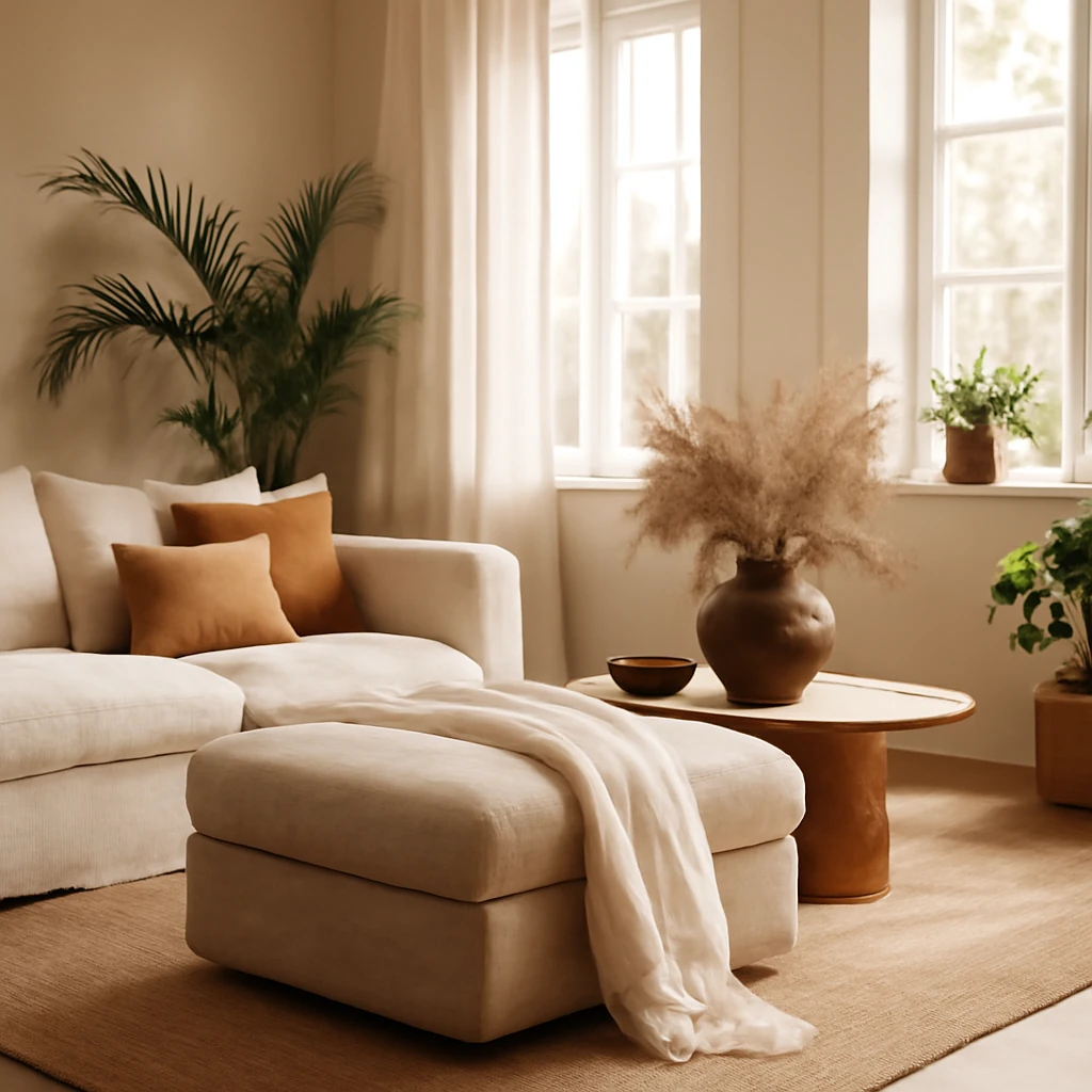
The ottoman: flexible sleeping and seating for European homes
A versatile furniture hero: the ottoman that doubles as seating and sleeping space.
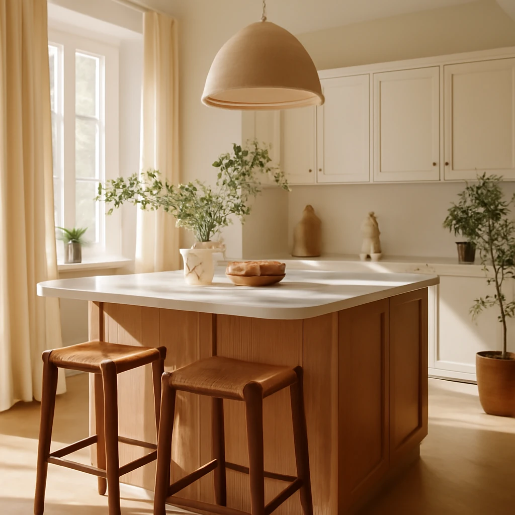
The Kitchen Island: A Complete Guide to Planning, Layouts and Styles Across Europe
A practical guide to planning and styling kitchen islands in European homes.
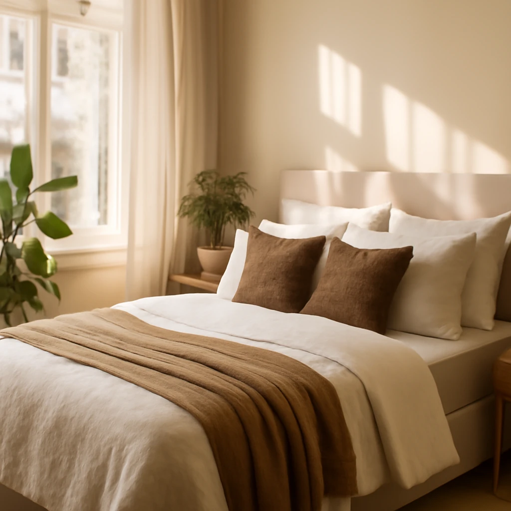
Creating a Hotel-Worthy Bed: Layering and Styling for European Homes
Master the art of dressing a bed that elevates any European bedroom.